How we built a reassuring, accessible website for an adolescent mental health provider serving seven locations across four states
Most websites are designed for people who are browsing. This one had to work for a parent sitting in a parking lot at 11pm, phone in hand, trying to figure out whether their fifteen-year-old needs a therapist or an emergency room.
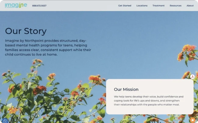
That single scenario drove nearly every design decision on our client’s website, an adolescent mental health and substance use provider treating teens ages 12 to 17. The site had to consolidate seven locations across Colorado, Idaho, Nebraska, and Washington into one coherent home, speak to two very different audiences at once, and stay calm while delivering genuinely heavy information.
Table of Contents
At a glance
- One unified site covering seven locations across four states, organized so families find their nearest program in a single step
- Two audiences, two doorways: parallel resource sections built separately for parents and for teens
- Text contrast measured between 10:1 and 16:1, far exceeding the 4.5:1 minimum the WCAG 2.0 AA standard requires for website accessiblity
- 18px body copy as the default, sized for stressed readers on phones
- Correct accessibility fundamentals: one H1, sequential headings, a visible skip link, all 29 homepage images with deliberate alt attributes, and a muted hero video that never plays audio unprompted

Designing for a parent in crisis
The primary user is not a patient. It is a parent, and usually a frightened one.
That reframing changes what “good design” means. A parent in that state is not evaluating brand personality. They are scanning for three things: can you help my kid, are you near me, and what happens next. Anything that delays those answers is a design failure, no matter how attractive it is.
So the homepage answers all three above the fold and keeps answering them. The phone number appears in the header, in the crisis section, in the insurance section, and in the footer. A dedicated “Need Urgent Support for Your Teen?” block exists specifically for the parent who cannot wait for a form response, and it says plainly that the team will help figure out the next step. Getting started is spelled out as three numbered steps rather than left as an implication.
Program details are stated in specifics rather than marketing abstractions. Parents are trying to work out whether treatment can coexist with school, work, and childcare. Vague copy forces them to call to learn basic logistics. Concrete copy respects them.
The navigation reflects the same thinking. Every top-level menu item carries a short line of helper text underneath, so Admissions Process reads “Learn what to expect as your teen begins treatment with us.” Nobody has to guess what is behind a label while they are anxious and skimming.
Two audiences, two doorways
Teen treatment has a structural communication problem: the person who pays and decides is not the person who attends.
Rather than blur those needs into one voice, the site’s Resources section splits into For Parents and For Teens as sibling destinations. Parents get guidance on understanding and supporting their teen. Teens get a plain explanation of what treatment is actually like. Same clinical program, two honest framings.
That split matters for trust in both directions. A teen who reads a page written entirely to reassure their parents will correctly conclude the site is not for them. A parent who lands on copy meant to meet teens where they are may question whether the clinical care is serious. Giving each audience its own door lets both feel addressed rather than talked around.
Accessibility as a standard, not a retrofit
Astute maintains a documented internal accessibility standard built on WCAG 2.0 Level A and AA, covering contrast, alt text, heading structure, keyboard navigation, focus order, form labels and error handling, consistent navigation, and skip links. It is applied during design rather than audited afterward.
On this site, the measurable results for contrast ratio comfortably clear the bar:
| Element | Contrast ratio | AA requires |
|---|---|---|
| H1 on hero | 16.38:1 | 4.5:1 |
| Section headings | 14.63:1 | 4.5:1 |
| Body copy | 16.38:1 | 4.5:1 |
| Navigation links | 14.73:1 | 4.5:1 |
| Buttons | 10.32:1 | 4.5:1 |
Every measured combination exceeds not only the 4.5:1 AA minimum but also the 7:1 AAA threshold.
The structural fundamentals hold up too:
- Exactly one H1, then a clean sequence of H2s and H3s with no skipped levels, so screen reader users get a real outline instead of visual-only hierarchy
- A visible “Skip to content” link, which the standard calls for explicitly
- All images carry deliberate alt attributes. On the homepage alone, four convey information and have descriptive text; 25 are decorative and carry intentionally empty alt so screen readers skip them rather than reciting filenames. Zero images are missing the attribute, which is the distinction most sites get wrong
- The hero video autoplays and loops with no audio track surfacing, satisfying the rule that nothing should play sound unprompted
- A published Accessibility Notice, linked in the footer alongside the privacy policy
None of this is groundbreaking. It is the standard. It is what happens when accessibility is a priority from the start, rather than a remediation ticket filed after launch.
Seven locations, one site
The site pulls seven programs into a single destination, grouped in the navigation by state: Fort Collins and Westminster in Colorado, Boise and Nampa in Idaho, Lincoln and Omaha in Nebraska, and Seattle in Washington.
A parent in Nampa thinks “Idaho” before they think “Nampa,” and a parent in Westminster may be willing to drive to Fort Collins. State-first grouping matches how families actually reason about distance, and it lets the structure absorb new locations without a redesign.
How the work actually ran
The design sequence is deliberately front-loaded. A crawl of the existing footprint comes first, then a site map, content buckets, and a working session among the design, content, and development teams on content types and URL structure. Next we plan the site navigation, then wireframes, before jumping into design. We actively develop a style guide alongside homepage design and subpage designs in preparation for handoff to development for the site build.
Development gets global standards early. Colors, font families, navigation, and buttons are locked as soon as the homepage is approved, so build can begin on the foundation while subpage design continues. It is a small, agile sequencing habit that expedites the timeline on every project.
Why this kind of design work matters
For most businesses, a confusing website costs conversions. For a family in crisis, a confusing website costs time they do not have, and possibly the decision to seek help at all.
Design, in that context, is the difference between a parent finding the right level of care for their child versus feeling helpless and closing the tab. A bright, reassuring color palette, easily legible typography, specific details, real accessibility, and a structure that matches how families actually search are not stylistic preferences. They are the job.
Need a website that works for people under stress?
If your audience arrives worried, rushed, or overwhelmed, the usual design instincts work against you. Clever navigation, small elegant type, and low-contrast minimalism all read as friction to someone who needs an answer now.
Astute designs and builds websites for healthcare and other high-stakes categories, with accessibility built into the design phase and information architecture shaped around how real users actually search.
Good to Know
FAQs About Designing for Healthcare and High-Stakes Audiences
How is designing for a healthcare audience different?
The user is often stressed, sometimes frightened, and rarely browsing. That inverts several default instincts. Type should be larger than fashionable, contrast higher than trendy, navigation labels more explicit, and logistics more concrete. Anything requiring interpretation is a cost paid by someone who has no spare attention to pay it with.
What does WCAG AA actually require for contrast?
A minimum ratio of 4.5:1 between text and its background for normal-size text. AAA raises that to 7:1. Choosing a dark primary and a light background surface tends to clear both thresholds naturally, which is why palette decisions are accessibility decisions, not just aesthetic ones.
Should decorative images have alt text?
No, and this is the most common accessibility mistake. Decorative images should carry an empty alt attribute so screen readers skip them entirely. Images that convey information need descriptive alt text. What is never acceptable is omitting the attribute, because then assistive technology may read out the filename, making the browsing experience confusing and frustrating for those users.
How do you design one site for multiple locations?
Group by the geography your users think in first, usually state before city, and build the pattern so new locations slot in without a redesign. A family reasons about distance regionally, so a structure that mirrors that reasoning helps them self-select in a single step.