


Project Summary
Northpoint Recovery didn’t just need a refresh; they needed one site that could do the work of nine.
We rebuilt the experience end-to-end: streamlined + intuitive navigation, clarified paths to care, and consolidated 9 locations into a single, scalable domain built to preserve SEO equity.
The result: A cleaner, calmer journey for users and a stronger platform for long-term growth.
Content & Design Overview
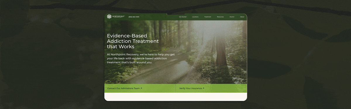
When we began working on the Northpoint Recovery website, we inherited a digital experience with strong information, but its structure and hierarchy made it harder to scan and navigate. Key services and next steps weren’t always easy to spot at a glance, and core CTAs (especially Contact Us) could blend into the page instead of guiding action.
For a treatment center, that friction matters. Many visitors arrive in a high-stress state, looking for fast confirmation that the right kind of help is available. Others may not be ready to reach out yet, but they still need a clear path to learn, explore options, and build trust.
We reworked the experience to improve clarity, strengthen decision-making cues, and build a more intuitive flow across the site.
Our Strategy:
- Use Northpoint’s brand color palette intentionally to create visual structure, guide attention, and reinforce brand recognition
- Establish a clearer visual hierarchy so visitors can scan faster and find what matters without effort
- Make services and treatment areas easy to spot and understand at a glance on the homepage and throughout the site
- Strengthen CTA placement and consistency across key pages to guide users more naturally
- Improve mobile readability with cleaner spacing, typography, and content grouping
- Align imagery and messaging to reinforce trust and reduce hesitation
- Build intuitive user pathways that keep people moving through the site, even when they aren’t ready to convert yet
Contact Us Page Updates That Support Faster Action
The Contact Us page carries a lot of weight. It’s one of the main CTAs across the site, so a big share of high-intent visitors land here after they’ve already decided they might need help.
It also acts like a “handoff” page. People arrive with urgency, questions, and hesitation, and the page has to do three jobs quickly:
- Confirm they’re in the right place (trust + relevance)
- Make reaching out feel doable (lower stress, clear steps)
- Remove last-minute friction (confusing forms, missing context, unclear next step)
If the page feels cold, cluttered, or unclear, it can cause drop-off at the exact moment someone is closest to contacting the team.
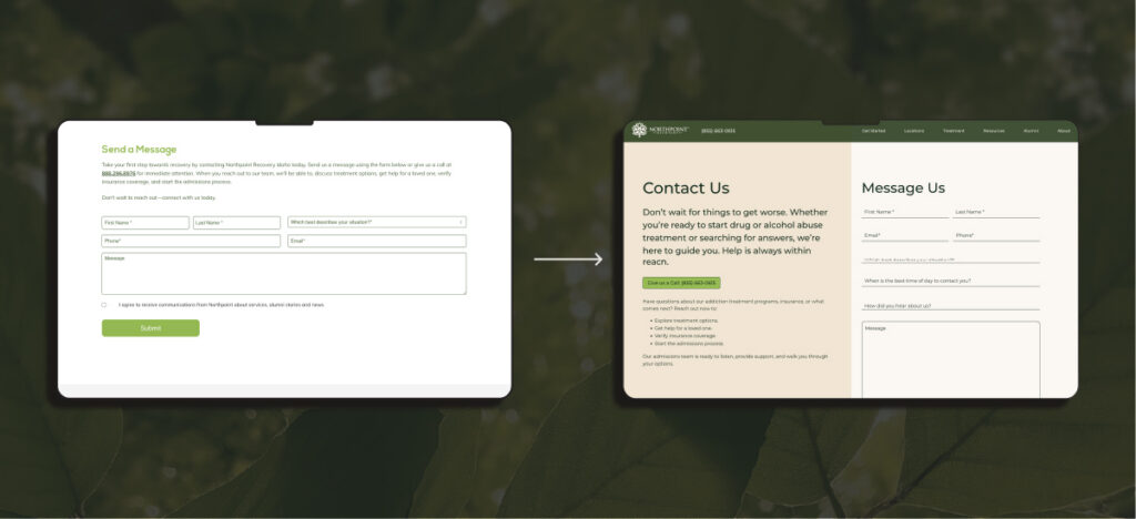
Before:
The original layout relied heavily on boxed sections, dense copy blocks, and limited visual hierarchy. Important information was present, but it required effort to scan. Calls to action blended into the layout instead of guiding the next step.
After:
The redesigned pages create a more natural flow. We simplified the structure, introduced intentional spacing, and made headlines more direct and readable.
Each section now leads with clarity, followed by concise supporting copy. The result is a page built to convert high-intent traffic while still feeling supportive and calm.
Mobile Experience That Feels Human
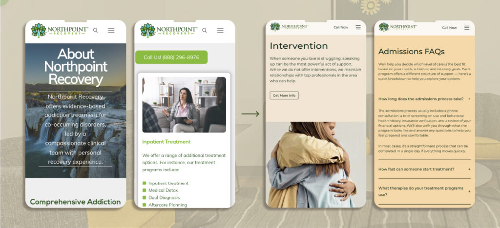
Before:
On mobile, the content felt compressed. Text-heavy sections and tight spacing made it harder to scan, especially for users already under stress. Navigation required more effort than it should.
After:
The new mobile design prioritizes readability and emotional clarity. Headlines are larger and easier to absorb. Content blocks are broken into digestible sections with clear visual separation.
We also refined the hierarchy of information. Core services appear clearly. Calls to action stand out without feeling aggressive. The experience feels supportive rather than overwhelming, which is critical for people seeking addiction treatment on their phones.
Treatment Areas You Can Understand at a Glance
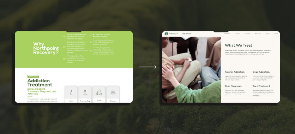
Before:
The site communicated services, but the way the content was grouped and presented made it harder to scan.
Visitors had to read deeper to understand the full scope of what Northpoint treats, and key options could blend together on the page.
After:
The redesign supports two things at once: emotional trust and practical clarity.
From a UX standpoint, the “What We Treat” content is now easier to spot at a glance because the page uses stronger hierarchy and clearer grouping. Headings do more work. Spacing creates separation. The layout encourages scanning, so users can quickly confirm, “Yes, they treat what we’re dealing with,” without hunting.
That’s smarter navigation for this type of site because many visitors arrive in one of two modes:
- Diagnosis-first: they already know what they’re looking for and want confirmation fast.
- Symptom-first: they don’t know what to call it yet, so they’re scanning for something that sounds familiar.
By making treatment areas more visible and easier to compare, the site reduces cognitive load and helps users move forward faster.
The imagery and tone reinforce the same goal. The experience feels supportive, grounded, and clear, which helps build trust while guiding users toward the next step.
SEO Overview
Beyond improving the on-site experience, we also rebuilt the technical foundation to support long-term organic growth.
Northpoint previously operated 9 separate websites, one for each location. That structure split authority across domains, created duplicate content issues, and made long-term SEO growth harder to scale.
This project required more than a redesign. It involved consolidating 9 full websites, including 9 blog libraries, into a single high-performing domain without losing rankings, traffic, or location relevance.
We approached this as a full structural rebuild. The goal was to unify authority, clean up content overlap, protect existing equity, and create a framework that supports long-term, scalable growth.
Our Strategy:
- Consolidate 9 separate domains into one authoritative site to centralize ranking power and reduce domain fragmentation
- Audit blog performance across 9 libraries, removing duplicate content and strengthening overlapping topics into higher-quality, unified resources
- Map and implement hundreds of 301 redirects to preserve link equity and protect existing rankings
- Develop a scalable geopage strategy to maintain strong location-specific SEO within a single domain
- Rebuild site architecture to support clear internal linking between services, locations, and educational content
- Optimize page structure, metadata, and on-page elements during the redesign to align with search intent and improve crawlability
- Create a clean, repeatable content framework that allows new locations and services to be added without structural disruption
Websites Built on Strategy, Not Just Design
Every successful website starts long before design comps and development tickets. For Northpoint, this wasn’t simply a redesign or migration. It was a full structural rebuild rooted in research, user psychology, brand alignment, and scalable SEO architecture.
We approach projects like this holistically. UX decisions support conversion. Content structure supports search visibility. Technical architecture supports long-term growth. Each layer works together so the site doesn’t just look better — it functions better.
The result is a digital foundation designed to evolve alongside the organization.
Our Process
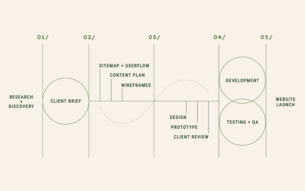
How We Turn Complexity Into Clarity
Large-scale projects like this require more than execution. They require discipline in planning, alignment across teams, and a clear roadmap from discovery through launch.
Our process ensures that:
- Research informs structure
- Structure informs design
- Design supports usability
- Development reinforces performance and scalability
- Testing protects quality before launch
Every phase builds on the one before it. That’s how we’re able to consolidate multiple domains, protect SEO equity, and deliver an experience that feels intuitive to users.
We don’t treat design, SEO, and development as separate tracks. We build them together, intentionally, so the final product supports both immediate usability and long-term growth.
Build a Website That’s Ready to Scale
A strong website does more than look polished; it guides visitors with clarity, supports search visibility, and creates a structure your team can grow into over time. When design, content, and SEO are aligned from the start, your site becomes easier to navigate, easier to expand, and easier to manage.
That kind of foundation reduces friction for users and removes limitations for your business. It gives you room to add locations, launch new services, and evolve your messaging without rebuilding from scratch.
If you’re planning a redesign or launching an all-new site, we’d love to partner with you. Contact us today to learn more about our website and digital marketing services.