The Client
Based in Florida, Hush Pup Co. is a strong advocate for transformation in the dog community. They empower dog parents to understand the underlying issues that lead to behavioral problems and provide a product to help treat these issues. Hush Pup’s success comes from putting the dog first. They are committed to creating calm, confident companions. To attain this sense of harmony, they provide a compassionate and customized solution to inform and aid pet owners on how to best support their anxious dogs.
The Problem
When we were first engaged by Hush Pup Co. they were just getting started. They were a funded start-up and were ready to start establishing their brand identity. They needed to first establish their overall brand, then needed to design eye-catching labels and packaging for their products.
Our Solution
The Astute team quickly got to work with a kickoff meeting to establish goals, timelines, and set the scope of what needed to be completed in this engagement. The first thing our team got to work on was establishing the archetypes and personality of Hush Pup Co. This is an important part of the branding process as it helps shape your brand’s tone of voice, mission, values, and how you present yourself overall.
Hush Pup Co. is considered to be a lover, magician, and innocent archetype. These archetypes were carefully considered to reflect the mission statement and brand promises of the company, while also establishing company alignment and authentic customer-facing messaging.
Next, our team began work on designing the different elements of branding and packaging. The first thing that needed to be completed was their logo. The primary logo is a badge shape and is inspired by a dog’s spots in it’s coat. The typeface used is a modern and elegant font with calligraphy-like curvature, making the brand feel young, yet sophisticated. Lastly the icon on the logo is a play on the lover archetype. It is an abstract heart-shaped nose and content dog smile that is to be used in the various product designs.
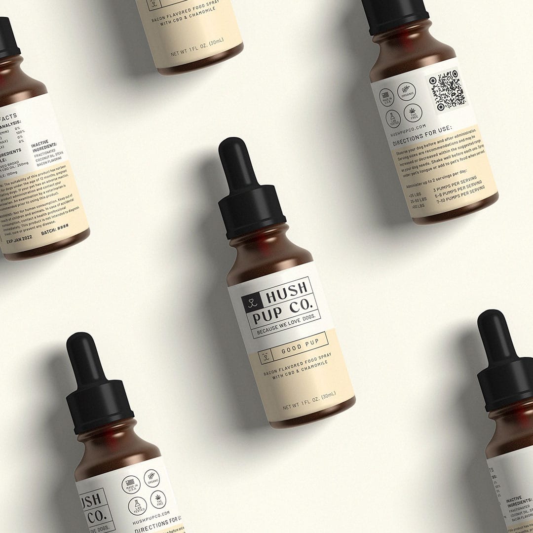
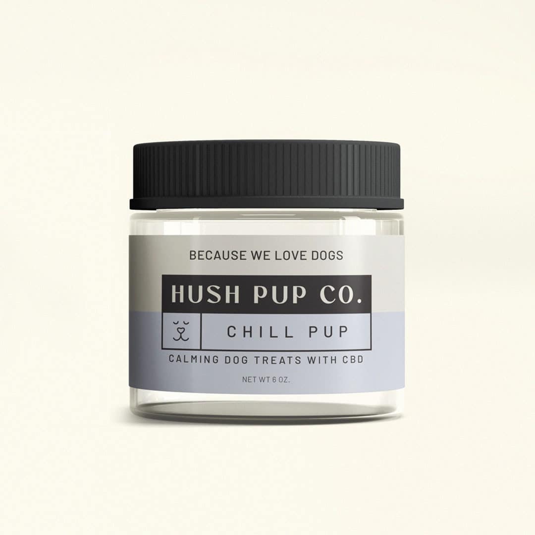
Once we had established the logo we began work on their packaging. Their packaging needed to feel clean, modern, polished, and friendly. The packaging is designed to promote trust, with transparent messaging about the formula and intended uses.
Additionally, smaller package designs use simpler logo treatments, while larger items include the Primary spot logo. Black and cream anchor all the packaging design, while supplementary color is used as a tool to differentiate between the intended uses of products.
This was a fun project for the team at Astute and we are very pleased with how the branding and designs turned out for Hush Pup Co. The finished product was a set brand identity that came equipped with strong designs, a clear identity, and eye-catching packaging that all helps to tie together the Hush Pup Co. brand.


