At Astute Communications, every project begins with one goal: to create an inspiring online presence for our clients. But in order to build things that inspire, we must be inspired ourselves – a tall task in today’s hectic world.
Like most of us, I find nature inspiring. Adventure as well. As a business owner, a husband and a father of two, I don’t have many expeditions in my future. I get tunnel vision on my problems and things–to–do, and don’t look up till the seasons have changed. And since I believe there is a direct correlation between inspiration and good work, when I’m in need of a jolt and can’t go sail the open waters I like to visit the following websites to spark that sense of discovery and wonder that is so essential in creating inspiring work.
Enjoy!
Sidetracked
www.sidetracked.com

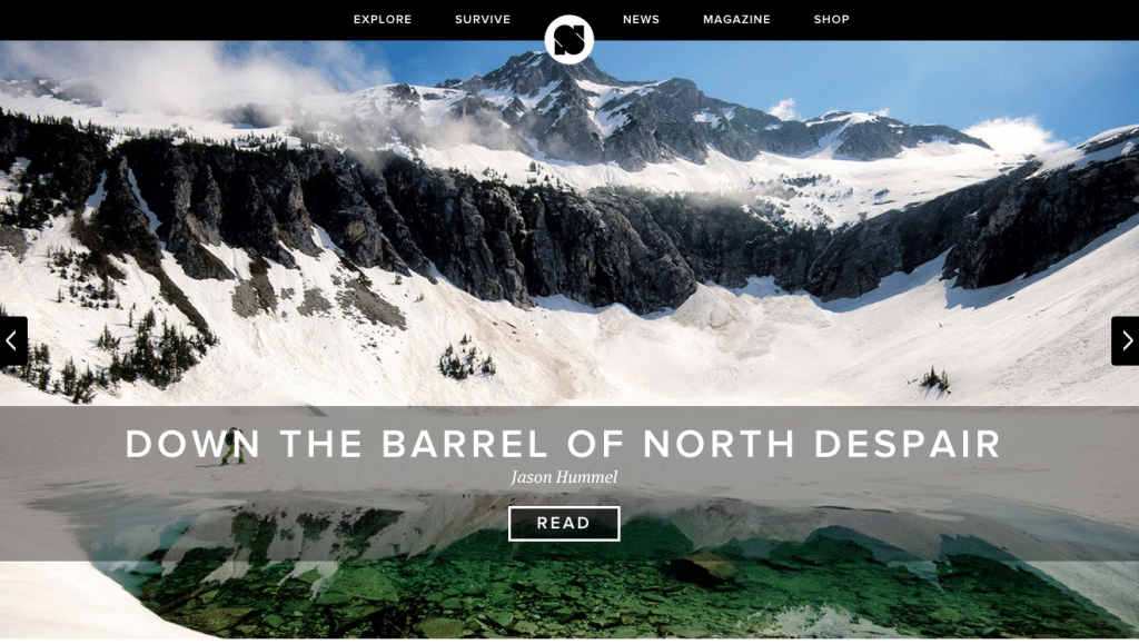
Sidetracked is a robust travel website (of which there are many) that is also really well designed (of which there are few). It has a very clean interface, and I really love the search functionality. Users are able to refine their search by continent, type of geography, type of travel, etc.
There are also featured stories on the homepage when you log in. These trip reports are a combination of great photography and obscure locations that tell the story of adventure in vivid detail. Some examples include highlining in the High Sierras (basically tight rope walking between two peaks) and a photo-log of 125 days spent in Amazonia. The type of adventure catalogued here is extreme and gives us normal folk insight into these little niche worlds that are markedly different from the average American life.
TED Talks
www.ted.com/talks

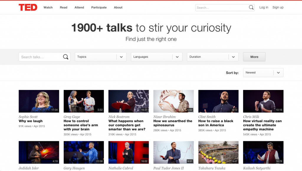
Earlier this year, I was lucky enough to attend TEDx Nashville. The popularity of TED was pretty clear: there were 2,000 people at TPAC with me. Why is TED so popular? I’m sure other people can answer better than me, but in my opinion, TED has exploded because it’s one of the first places online that is a collective of a wide array of experts sharing their knowledge free of charge. It’s broad. It’s not subject oriented. It’s simply a place for professionals to spend 15 minutes educating those who know less. Want to know how they landed a rocket on a comet? There’s a video for that. Want to hear a hedge fund manager argue for a new approach to capitalism? It’s there.
The cool thing about TED is when you visit the site you don’t know what you’re going to learn. By not being about a particular subject (Technology, Entertainment andDesign is a wide net, and can be about almost anything), the website encourages an open mindedness that the user typically doesn’t find with other sites. When you visit the other websites I’ve listed, you know what to expect. With TED Talks you don’t. It allows you to become a student again, to turn off the control button that’s always set in the “on” position and get lost in a subject for a while. I must say that TED Talks are my new power nap. Typically 10-20 minutes in length, these talks are a quick shot in the arm of inspiration!
NASA
www.nasa.gov

Show of hands: Who has actually visited the NASA website? I bet not many of you. And who could blame you. All government websites are tedious and boring, right? Well in this case you are missing out on one of the best-designed places on the web when it comes to the exploration of space.
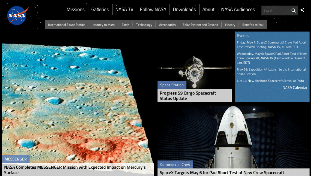
With all the cool tech companies out there getting involved in Space Exploration (SpaceX and Virgin Galatic being the main 2) I expected one of them to have the best web presence. However, I have to give NASA the nod here when it comes to their website. www.nasa.gov is vast, with features such as live TV that covers all missions and a great navigation feature that allows users to refine by mission, images, or topics.
Additionally, the website has a robust video library with everything from the history of Hubble program to the New Horizons to Pluto mission. The website has a very clean interface and a great navigation that is easy to use. I spend 10 minutes on this website to refill my sense of wonder and to put perspective on the things I’m dealing with. I never leave not amazed.
Tiny Atlas Quarterly
www.tinyatlasquarterly.com

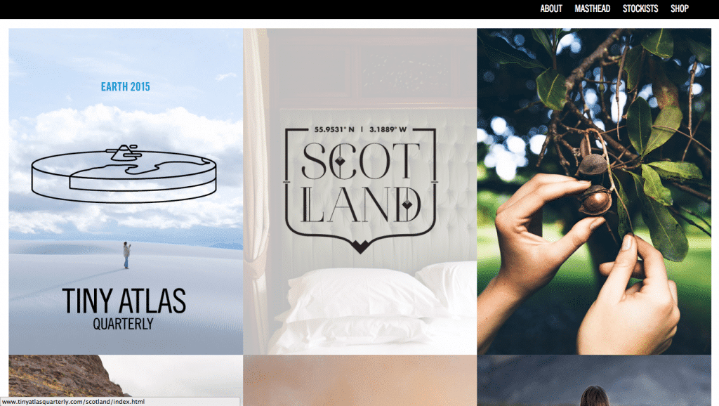
This online magazine is a travel photography website that tells very interesting stories through breathtaking pictures. There are beautiful landscapes, intimate portraits and exciting action shots a-plenty. What’s neat is that this site is a collaboration between many artists, so the perspective is always fresh.
From the users point-of-view, the site could hardly be simpler. It has a clever identifying hover function done with quirky graphics/drawings that I find particularly well designed. This website marries the homespun and the modern very effectively to create a very unique web presence.
Thanks for reading and please share with us where on the web you visit for inspiration.
Want your website to inspire? Contact Us!
