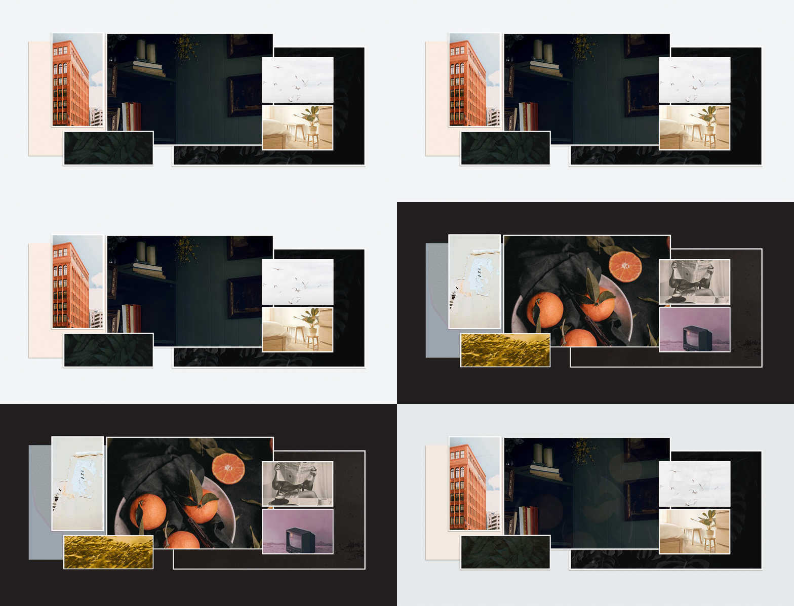
We’re pretty excited to share the results of our recent brand refresh. We got together last year for a retreat where we played games, hiked to a waterfall, and enjoyed actual nature. We also spent time connecting with each other and reflecting on our brand. The last time we refined our brand was in 2019. In the design world, and especially through pandemic years, that’s the equivalent of approximately 34 years ago. Needless to say, a lot has happened since 2019. Some changes were expected; many were not. We took the challenges in stride and learned a lot about ourselves in the process.
Since our approach to branding is rooted in the complexities of human personalities, we should take a step back for some introspection every so often. It’s been rewarding to gain new perspectives through a lot of change and thoughtful conversations. We’re coming out the other side with a new appreciation for who we are. It’s nice to remember why we do what we do every day, right? So, let’s talk a little about what decisions we made.
We identified some new priorities.
One of our goals with the brand refresh was to showcase the renewed determination we found in ourselves and our work. In true strategist form, we looked again at Jungian archetypes for guidance. While many of the characteristics from our existing brand still rang true, we found ourselves looking at a more mature and experienced version of ourselves (we’ve seen some things). This time, we leaned into a more polished direction. Initially, we defined our character as a primary Explorer persona, supported by the Sage and Creator. While the Explorer will always feel like home to us (always seeking, never settling), we moved those values into a supportive role next to the Sage. We gleaned from the Ruler our newest strength — confidence. Forging ahead, we knew we needed to realign some methods in which we represent ourselves: visually and conversationally.

What updates did we make?
We took this opportunity to revisit all aspects of our brand identity. We started with the logomark. Using the same icon/wordmark format we’ve used in the past, the most effective change here is the typeface. The primary brand typeface we chose is Lexend Exa (Fun fact: the Lexend font families were created to aid reading comprehension).

We’ve also updated our brand messaging to connect with our audience on a deeper level. As part of this shift, we have moved away from the Explorer brand archetype, which emphasizes adventure and discovery. Instead, we’ve decided to lead with a blend of the Ruler and Sage archetypes. By adopting the qualities of the Ruler archetype, we demonstrate our commitment to leadership, authority, and the ability to guide our customers toward success and empowerment. Simultaneously, we embrace the Sage archetype, which embodies wisdom, knowledge, and a thoughtful approach to problem-solving. With this refined messaging, we aim to establish ourselves as trusted advisors that empower our clients to make informed decisions and reach their full potential.
Our color palette is notably different from our previous branding. The initial palette was a mix of nature-inspired tones: wintery white and blue, contracted with richer colors like pine and clay. This time, we felt more suited to a more saturated palette with a bold but friendly tone. Our primary colors include a mix of black and off-white neutrals. Our secondary palette highlights a mix of warm and cool hues with an expressive personality. This direction was taken to project more of our personalities throughout our brand and show a more unique character than before.

We’ve also focused on featuring more illustrations. Our style has evolved from simple geometric graphics to a more organic, hand-drawn direction. Where before the Explorer archetype heavily influenced our brand messaging, it has now found a more comfortable place in our illustration, informed by a multitude of references to culture and history.
embracing a bold new identity
After years of upheaval and uncertainty (yes, we’re still talking about COVID), our team found a lot of value in revisiting and redirecting our brand strategy. We’ve had fun exploring different ideas and remembering why we love what we do in the first place. While it’s easy to consider change too risky, there’s nothing like a worldwide pandemic to remind you that it’s inevitable. So, we’re happy to be saying, “New look, 👀who dis?”
wow, that sounds like a lot.
By now, you know that a brand is so much more than a logo. It’s complex. Three-dimensional. An identity unto itself. That means there’s a lot to consider. Often a term like “re-brand” is discredited as an inessential use of time and resources, especially when compared to other priorities. But a company’s brand impacts every one of those priorities. Trying to grow? A recognizable brand is key. Need to build trust with your audience? This starts and ends with a consistent representation of who you are and what is important to you. Recruiting? Potential employees want to know who they’re talking to. Aiming to build more alignment within your internal team? Align them under a shared mission and values. A strong brand strategy speaks directly to your audience.
Ready to talk about your company’s brand strategy? Reach out.
