


In the dynamic landscape of design, new and recurring themes help shape communication through creative expression. From the initial boom of the minimalist movement, to the continual resurgence of nostalgia, to the myriad of new illustration styles, and the rise of maximalism, these design trends play a significant role in echoing culture. Trends all come with their own nuance, challenge, and controversy. If not designed with careful intent, these trends can fall into trope-territory. Let’s examine the spectrum from the commendable to the contentious, the celebrated and the criticized.
FORM EVER FOLLOWS FUNCTION
Design exists to solve problems. Oh are you saying trends can help solve problems? Absolutely. It sounds silly, but if design really does influence our visual comprehension, and mirror culture, then trends can solve all kinds of problems—when done right. Much like art, good design challenges convention while sustaining relatability and interest. Take the new maximalist movement: its predecessor was minimalism. Everything was so clean, simple, and monochromatic. All of it started to feel the same and, well, we got bored. This is a trend-to-trope path we see when culture takes a shift in a new direction. So if maximalism is the solution, we can infer that the problem was bland monotony; design so stripped down that we were left craving personality and adventure (and maybe a little chaos, but we’ll come back to that.)
Of course there’s always going to be a place for the familiar. For new brands (or brands looking to refresh their identity) it can be helpful to take a more disruptive approach; and for that we look to new emerging trends. The best way to stick out from a crowd is to be unique, memorable, and authentic. But this is not just another trends report, we want to look at the context of design and dissect why some aesthetics have lost their impact. But in order to appreciate “the good”, let’s start with “the bad” and take a look at what we now consider to be tropes.
THE BAD
Let’s define what “bad” means in this context. When we classify styles as “bad” it’s not to say it’s poorly done or unsightly. That definitely exists, but for our sake, “bad” can be considered synonymous with “imbalanced”, “unsuccessful”, “ineffectual”, etc. Let’s look at some not-so-effective design styles.
LESS IS MORE LESS
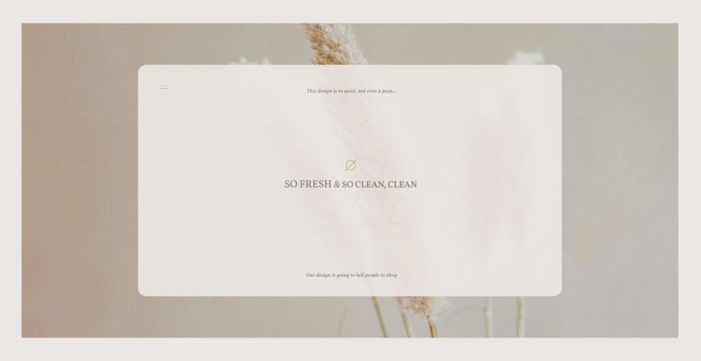
Speaking of minimalism, there is such a thing as too minimal. There’s an appropriate application of minimalist aesthetic for a lot of brands. The most successful use of this aesthetic is often communicating that brand’s value proposition of simplicity: Apple, Aesop, Everlane, Method, etc. It’s worth noting that being overly-simplistic can also communicate luxury, like COS, Audi, and CB2 to name a few. These are all exemplary minimal brands because it makes sense for them to live in that aesthetic. If the brand’s highest principle is simplicity, stability or luxury, it’s a great direction for that brand to embrace. However, if these are not the core values the brand is built around, it can mean this direction will flop. Design strategies are not one-size-fits-all, and just because it continually works really well for Apple, does not mean it will work the same for all brands.
At its best, minimalism offers easy navigation, quick information-gathering, and reducing stress. At its worst, minimalism is bland. Your audience may not notice you at all because they’ve seen so much of it that it all looks the same to them. Oh, another beautifully monochromatic brand with a sleek wordmark logo. While it achieves greatness in some places, it can easily sacrifice something more valuable: personality.
Minimalism arose in response to the oversaturation of visual design that preceded it. But a new problem arose from that. While functional, minimalism can lack persona, emotion, and story. Antoine de Saint-Exupery said “Perfection is achieved, not when there is nothing more to add, but when there is nothing left to take away.” The expression was taken to a drastic measure for a while, and it left us with a lot of dull brand experiences. The new challenge is redefining what to “take away” while preserving the parts that resonate with us now.
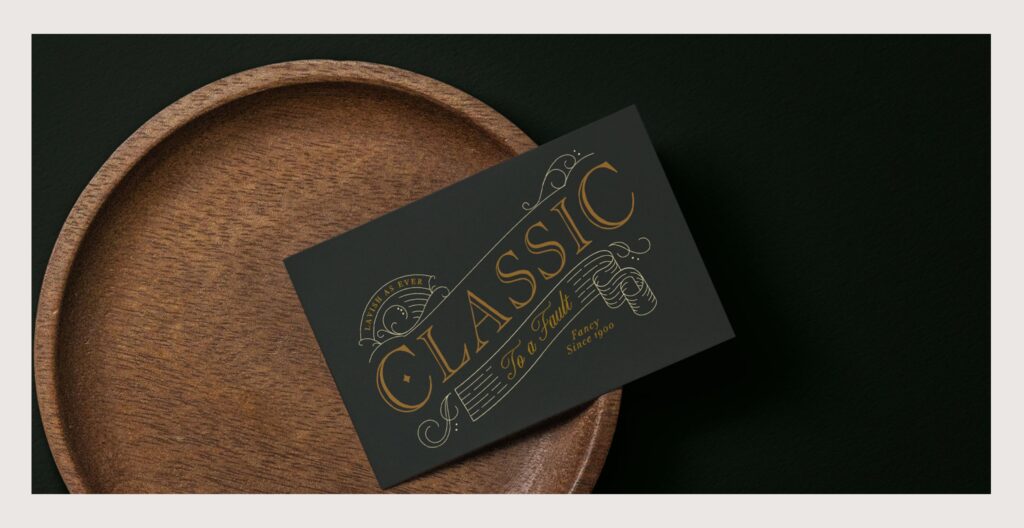
CLASSIC TO A FAULT
Classics are great; that’s why they’re classic. When we think of “classic” as a branding style, we think of visuals used to communicate a certain sense of tradition. What comes to mind is a feeling of baroque, high polished, ornate, or even lavish, details. Classic design often uses decorative serif typefaces, calligraphic flourishes, rich color palettes, high contrast, all which provide a sense of refinement. Classic brands sit in a leather tufted chair, with a velvet robe, adorned with gold pinky rings, smoking the finest cigar in a library… in a mansion. Okay, maybe that’s too much, but you get the idea. At its best, classic aesthetics can be beautiful, expensive, intelligent, and confident. But this can get stuffy, right? Classic visual devices can be used to elevate the brand feel. When this direction lacks balance with some more current trends, it can be very limiting to audience reach. This is where trend-to-trope can be tricky, because “classic” is good but “traditional” is snobby or worse, antiquated. A brand with classic appeal should feel like a top shelf bourbon, but not necessarily your Great Grandfather’s bourbon. A far more interesting and unique approach takes classic design devices and puts a fresh spin on it; maybe utilizing more youthful display typography or unexpected neon colors. The trick to avoiding trope is balance: finding ways to breathe new life into antiquity.
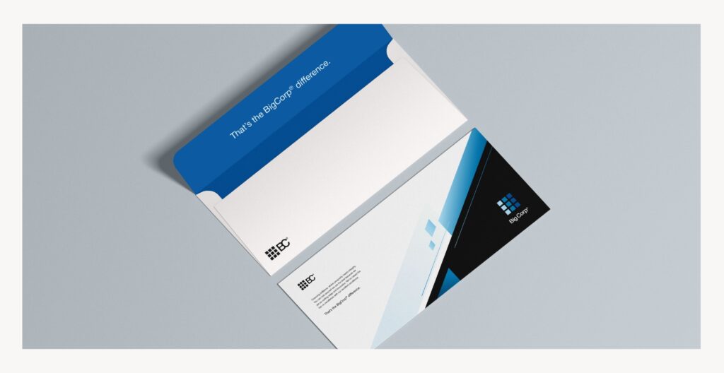
HYPER-CORPORATISM
Are you the CEO of Microsoft, eBay, or Google? If yes, then you can disregard this part of the article. For most businesses, the MS WordArt inspired branding is just plain wrong. (Hi Gap®, we’re looking at you.) Design aside, positioning your brand as a monopoly when it is not is the first mistake. But that’s a whole other argument. Tech inspired hyper-corporate design style emits a very specific image. This homogenization of brands is a big point of contention in the design community, it’s the same problem we discussed about minimalism—everything is starting to feel the same. This sterile and overtly geometric approach is suitable for tech brands, and businesses with global reach; as the style is incredibly adaptive to multi-lingual, multi-platform visuals. It’s very user-friendly and ADA compliant. However, for most companies this is an ill-fitting choice. If you are not a Fortune 500, then design needs to show more character than this style can provide. The brands that use this device have such long-standing reputations they no longer need to stick out from a crowd via branding. Besides, very few of these brands started with this style, they’ve ended up here over time. The trope that stems from this direction is the over-standardization of design—the sameness of brands. When lots of brands assimilate, they start to lack impact and identity. Is this all just from the same source? This style is often accompanied by our next trope: is-everything-just-stock?
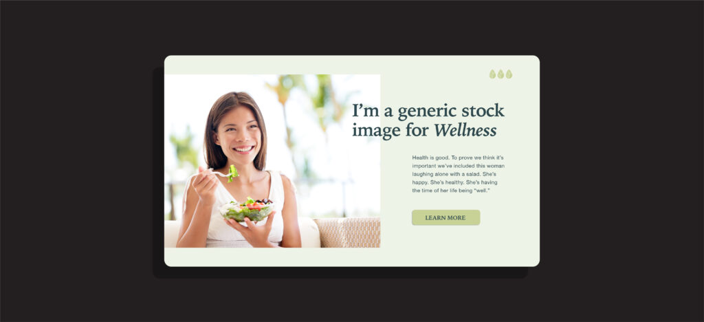
HI, I’M A STOCK IMAGE
We can all agree that the world isn’t perfect. Thanks to stock imagery, designers have a vast space to source assets from all over the web. But the problem created by this is the wealth of perfectly posed (and repeatedly used) images. AI is going to take this to a whole new level, which will surely run its course, too. Just like the photo that comes inside a picture frame, stock images can feel very “fake” or “staged” and this damages a brand’s impression. Stock imagery can be quite useful, it’s a matter of patience and finding the right fit, creating a collection that is cohesive, natural, and relatable. If you feel like you’ve seen it before, you have, and so has everyone else. It feels commercial, contrived, and generic. Who wants to be generic? No one. So let’s all agree to stop using images like “Woman Laughing Alone With Salad.” Unless the brand’s goal is to become a meme—then definitely keep doing this.
THE GOOD
Now that we’ve gone through some tropes, let’s look at some trends that are, well, trending. While not every brand needs to fit in a singular box, here are some designs that exemplify defined trends that you’ll be seeing more of in 2024.
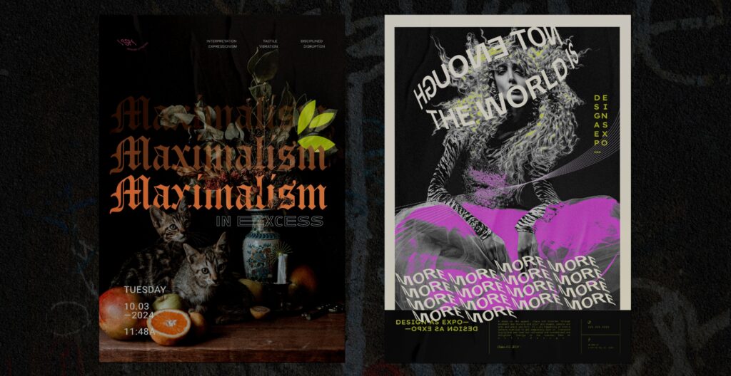
MAXIMALISM
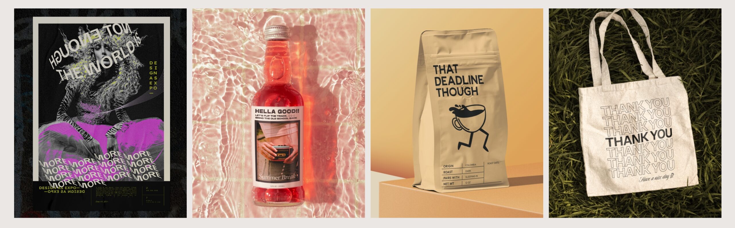
In response to the overwhelming use/underwhelming impact of minimalism, maximalism is the new black. Maximalism is not for everyone. It can be quite controversial, but there’s a renewed interest in excess that is very relevant right now. In a “post pandemic lockdown” world, people are excited to express themselves again. Everything got a little scary for a minute and we’re finally at a place where we crave a little chaos; not the kind that results in another lockdown, just the kind that makes scrolling the internet a more vibrant experience. Maximalism allows personality and art to come bursting through our screens, our homes, and our personal effects in new ways. This trend celebrates a renewed sense of adventure. We see this in design through the use of mixed media, motion, textures, patterns, typography, shapes and colors. While this design direction is fun, creative, and wildly emotive, the disorder produced can still hold a cohesive narrative and identity: controlled chaos. Breaking convention can be incredibly beneficial to brands, but not if it’s giving off an “unhinged” quality. The process of this design style is fun because it provides the most room for happy accidents, and unexpected results.
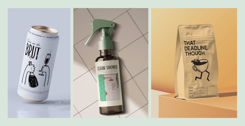
NEW WAVE
As a result of “stocky” illustration styles, and hyper-real AI generated imagery, a more nuanced and handmade approach to illustration is growing in popularity. This 2D style of mainly line drawings feel like they came right out of the New Yorker. When paired with soft color palettes and modern typefaces, it creates a quirky personality. This style emits a kind of nonchalance; it can seem charming or quaint, and sometimes carries a bit of a retro vibe. This trend is also a direct response to the landscape of brand’s taking themselves too seriously. New wave aesthetic lends itself well to brands that offer sophistication, but not without fun. Taking a less-polished approach has become a new lens to exude confidence, as if to say it “woke up like this”. That irony can be very impactful. This style has broken down elements from existing design tropes and combined them in a new way that feels really creative and personable.

THE ERAS TOUR
Nostalgia: that little dose of dopamine we all love to revel in. Culture keeps evolving, yes, but the time machine of nostalgia keeps spitting out past tropes as renewed trends, and it’s tough to keep up with. From the 20s-40s art deco, to mid-century lines and textures, 70’s rounded-serif type, 90s tech and fashion comebacks, glorified Y2K memories, and the what-even-is-this-time-period Wes Andersen charm… It’s all being pulled from today. From a cultural standpoint, it’s interesting to call on past eras because of what they represented. The 60s embraced revolution and peace, but also turmoil. The 90s were centered around innovation, but also apathy. It’s curious to think that the Deja Vu of the past holds some perspective for our current culture. For some, it’s the comfort of simpler times. For others, it’s a chance to experience a time they weren’t around for. Either way, paying homage to the eras will continue to go into a blender and come back out with new appreciation. We’ve embraced that things are momentary, and nostalgia has permeated design in a way that sparks a warm feeling, like running into an old friend. While past trends can be so helpful to resonate with new audiences, it’s important to stay self-aware and not fall into a similar pitfall-trope (as discussed in “Classic to a Fault”.)

BRIGHT + LOUD
This trend’s goal is to be bold, and drama is the answer. This is another reaction to the minimalism movement as if saying “please, not another safe and inoffensive color palette with a small line of type.” While this style can sometimes bring a sense of nostalgia, it’s not married to any specific era. As a cultural reflection, this type of branding goes hand-in-hand with the notion of personality over safety. The bolder the better. The bright and loud aesthetic is very effective at grabbing attention, like inviting your audience to a pool party. At best, it’s friendly, charming and playful. At worst, it can seem a bit too childish. If the brand promise is about happiness, this direction is great for injecting loads of personality in that statement. It can serve as a good strategy to differentiate from more reserved competitors, and shows quite a bit of confidence.
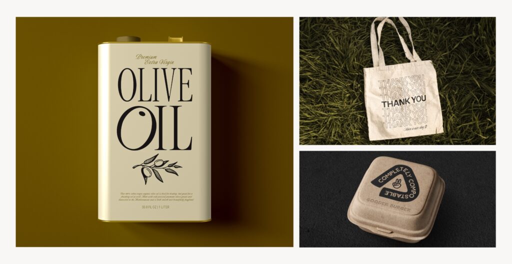
SUSTAINABILITY
While not necessarily a specific style, sustainability has become such a strong value to consumers that it’s impossible not to see its influence on design. It’s encouraging to see a lot of brands embracing sustainability. Several criteria work to uphold this value. People-focused ethics are very important for sustainability. This takes into account fair labor policies and practices, safety, freedom of association, equality, diversity, and fair wages. Brands should empower their people. Animals are another important area of sustainability. This may mean providing vegan-friendly products, but also maintaining cruelty-free and animal welfare practices and certifications. Planet-focused values are an obvious point of focus. Such efforts can be evaluated by the brand’s environmental policies, waste management practices, use of green materials, energy consumption levels, impact on pollution, deforestation rates, effects on water and biodiversity, as well as carbon emissions. This last one is probably the most evident with regards to design ‘trends’. Although it should be clear that these should not be considered trends, these are standards for ethical business. Actually, because sustainability has become so commoditized, it’s important to demonstrate genuine accountability in the face of prevalent ‘greenwashing’ (which has become a trope.). Design can play a tricky role here, so it’s wise for brands to provide their audience with additional literature and transparency about these policies.
In terms of visual styles, this can be supported by any aesthetic. Sustainability may translate through people-centric visuals, environmental photography, transparent messaging, and even employer branding. Entire business models are innovating to meet this goal, as well. This is evident with the shift to product refill-systems, eco-friendly packaging, upcycle brands, and companies that spotlight their real employees. Sustainability has opened up some new avenues for design—and we’re here for it.
THE TRUTH
In simple terms: culture shapes design. For breaking convention and designing with new perspective, it was Paul Rand who said “The new becomes threatening, the old reassuring”. We often think of trends as superficial fads, but they don’t have to be. A trend is just a direction in which things are developing. It’s when trends outrun themselves that they become tropes; when the problem they serve to resolve is no longer relevant. Visual design is ever-changing. It’s true, trends will come and go at their own pace, but they serve as a direct line to the audience. Do not fear the new, embrace the forward direction. It’s never a bad time to reinvent, refresh, and re-emerge. Take stock of what’s important, and lean into the lens that best reflects those values in the current landscape. Branding and design need regular maintenance; pruning and re-shaping once in a while will allow it to thrive.
For more on design strategies, check out this post about creating a memorable brand image.