It’s not always a total overhaul! Big Events, Inc. has decades of experience planning events and they wanted to establish a comprehensive set of brand guidelines to elevate their business’ reach and reputation.
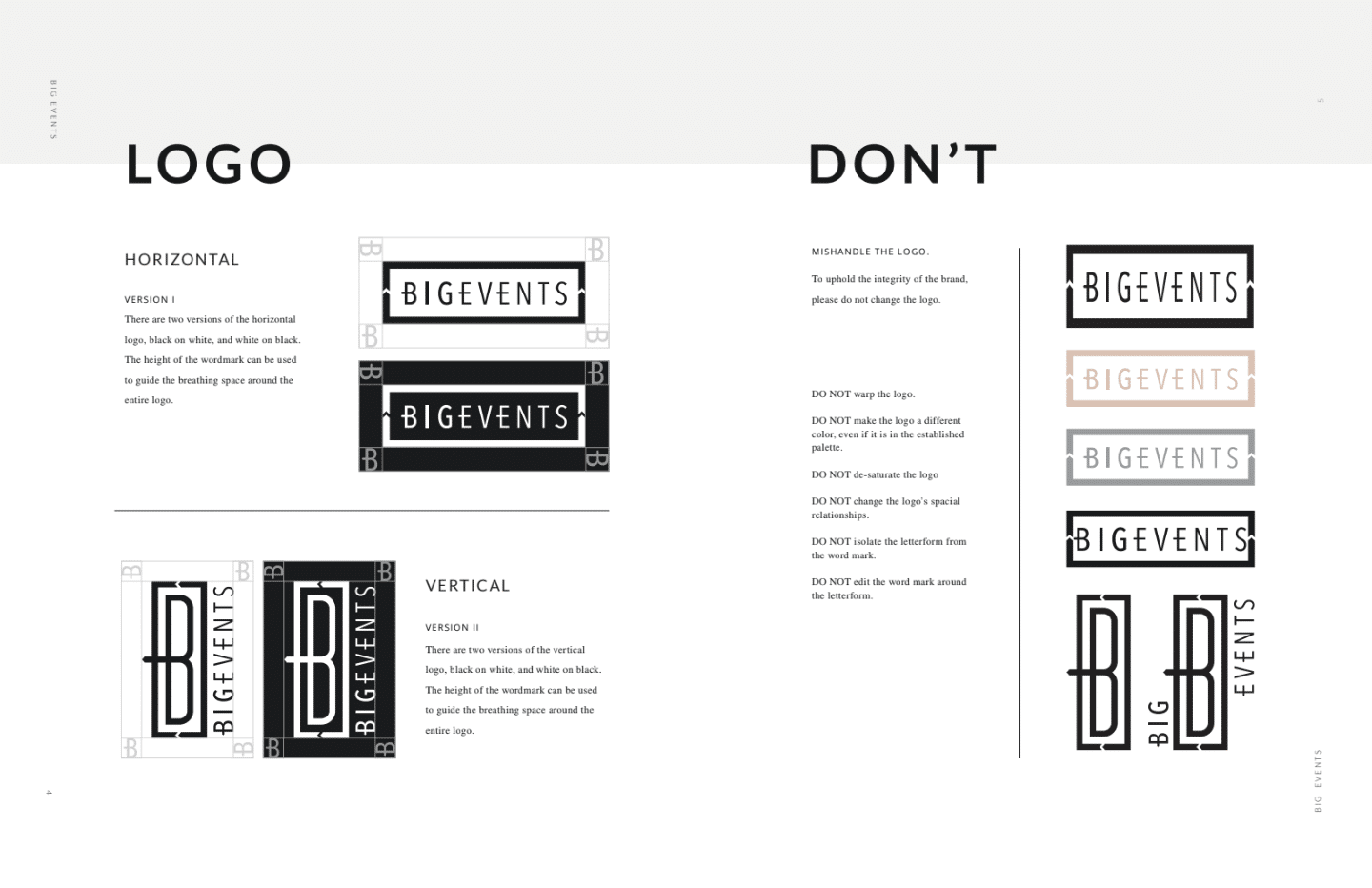
First, we took their existing logo versions and established clear usage guidelines. Guidelines included the original and inverse versions of both their vertical and horizontal logos, spacing requirements (don’t crowd the logo!), and things you should never do when using it. This is an important definition for brand consistency, and helps people who don’t have a background in design or a long history with the company understand how they can and cannot use the logo in the development of materials for the company.
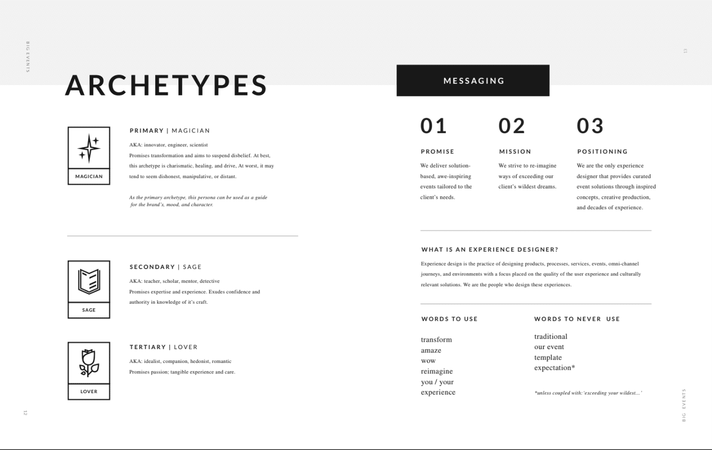
In order for us to be able to define the rest of the brand, we met with their team to get preliminary information for an Archetypal Analysis. Our archetypal analysis is a series of informed exercises derived from the Carl Jung theory of archetypal storytelling. This approach is effective because it enables us to communicate on the basis of innate human tendencies rather than the typical subjective language that is associated with creativity.
Through workshops and research we establish which archetypes aligned best with Big Events, and we chose a primary, secondary, and a tertiary character. From there, we utilize the primary archetype to inform the overall messaging, color selection, photographic direction, etc. and the second/tertiary to lay the groundwork of what your company does on a more functional and internal level.
With our archetypal analysis defined, we could begin crafting messaging and a defining a more comprehensive and consistent visual representation.
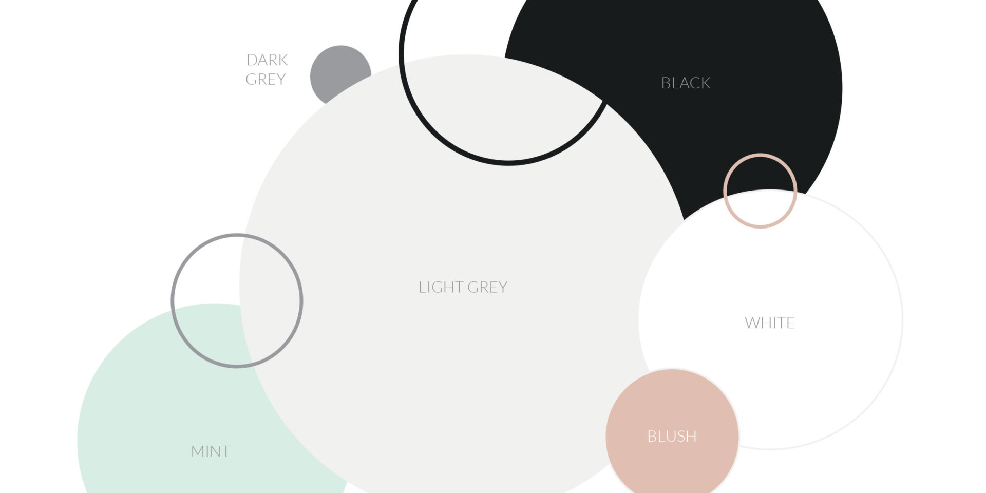
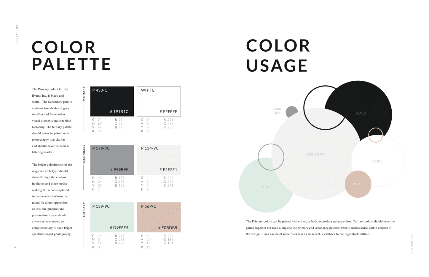
Next, we took great care in defining their color palette. Using the primary black and white that we see in their logo, we defined secondary soft greys to offset and frame other visual element and establish hierarchy. Next, we presented a new tertiary palette to compliment the brand. Using a muted palette allow Big Events to showcase their events with bright spectrum-based photography in support of their Magician brand archetype.
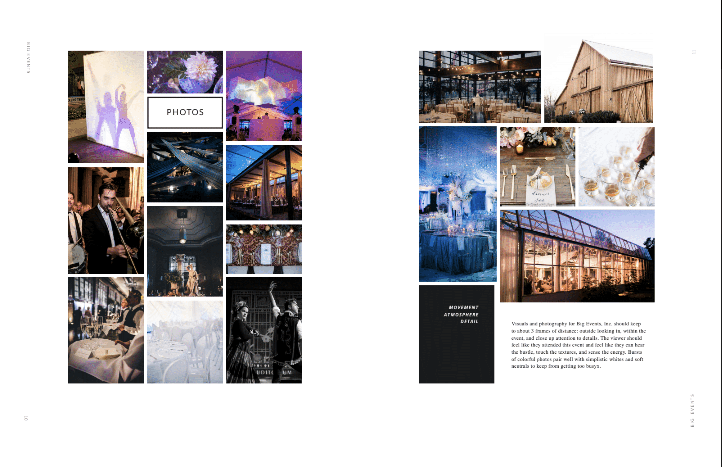
The definition of photographic direction was an important asset for the company. With ample opportunity for event photography, they wanted to be sure they were capturing the shots they wanted, and presenting their work in a consistent way. One important priority that we defined for the that the ideal options for frame of distance: 1) Outside looking in, 2) within the event, and 3) close up attention to detail. Additionally, we suggested that bursts of colorful photos pair well with simplistic whites and soft neutrals to maintain a consistency within the brand. These guidelines are often used by their team to provide direction to photographers, ensuring that they get the shots they need.
With decades of experience planning events in the Nashville market (and beyond!), Big Events is a recognizable brand with a long history designing experiences to remember. Family owned with a close knit team, their commitment to quality solutions and transformative events comes through in every conversation you have with them. Now, they know how to communicate those same values online and in print, in a way that rings true to them and tells a compelling story.
