


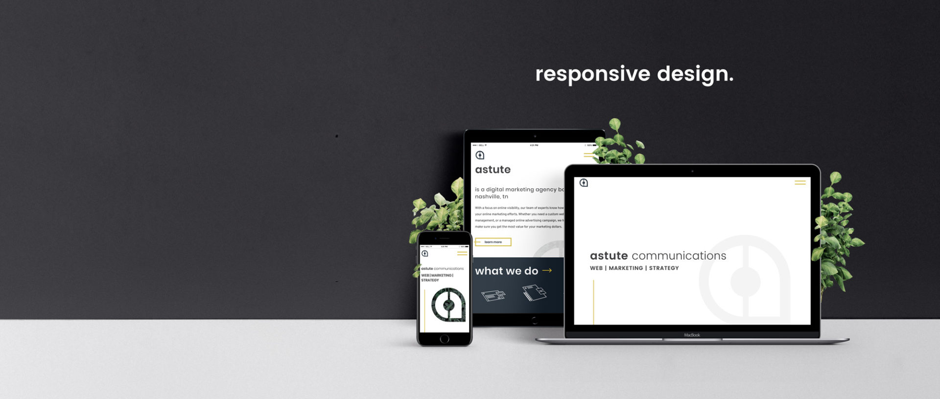
You are approaching the start of your website design and you better be thinking about how your future website is going to be viewed post-launch. Today, there are an endless number of ways to access the Internet and planning for a fixed width standard resolution desktop monitor is a thing of the past. There are a couple of things you can do to make sure your website is compatible with today’s modern standards:
- Think Mobile-First Web Design. Begin thinking about the smallest screen possible. As you design your information hierarchy, determine what information is the most relevant for your user experience. As you begin to look into larger screens, progressively enhance your website to become more feature-rich for those devices that can handle it.
- Consider Atomic Web Design. Atomic Web Design isn’t the only way to design for the responsive web, but it certainly makes sense to take the various elements of your website and combine them to create a complete design system. By using this method you are setting yourself up for success in responsiveness and future-proofing.
- Test. It is extremely important to run thorough and consistent tests of your website on as many different devices as you can throughout the process. This is where you are going to be able to identify problems, inconsistencies, and flaws in the overall user experience across devices.
Web design and development is an evolving industry, clearly shown in the way modern design has changed just in the past couple of years. The most important thing you can do for the success of your website is to keep it current with modern design and usability standards. If you regularly evaluate your website and keep it updated you are sure to find success from this vital investment in your business.